Choose one workflow, not a feature tour
Buyers watch a demo to answer one question: can I do my job with this? So the best demos follow a single workflow the way a customer would live it, not a tour of every menu.
Pick the job most of your buyers came for, then write it in three parts:
- The trigger: what happens in the customer's day that sends them to your product. A request comes in, a deadline lands, a report is due.
- The steps: the three to five actions in your product that handle it. Leave out settings, setup and anything people only do once.
- The result: the finished thing on screen, such as the schedule published, the invoice paid or the report sent.
If you sell to several audiences, make one short demo per audience rather than one long demo for everyone. A finance lead and an engineer want to see different workflows, and a 40-second demo of the right one does more than a five-minute demo of all of them.
Screen recording or animated product demo?
There are two ways to put your product on video, and they suit different jobs.
A screen recording captures exactly what happens on screen, click by click. It is the right choice for tutorials, onboarding and sales walkthroughs where the viewer needs to copy the steps. The downsides show up in marketing: text is tiny on a phone, the cursor wanders, loading states eat seconds, and every redesign makes it look dated.
An animated product demo uses the same real interface but directs it. The camera pushes in on the button that matters, components lift off the page so they can be read, waiting is cut to a single moment, and each scene lasts exactly as long as it needs to. It reads well on a phone and holds attention on a homepage.
A good rule: if the viewer needs to follow along, record the screen. If the viewer needs to understand the value and want to try it, animate it. Many teams use both, with a 30 to 60 second animated demo on the website linking to a longer recorded walkthrough in the help center.
How to write the demo script
Write the narration before you choose any visuals, then build the scenes to match it.
- Open on the situation, not the logo. One line the viewer recognizes from their own week.
- One sentence per scene. Each scene shows one step, and the narration says why that step matters.
- Do not narrate the cursor. "Now I click the Publish button" spends words on what the viewer can already see. Say what it gets them: "Publish, and the week is set."
- Use real numbers or none. "Confirmations roll in" is fine. "Saves 10 hours a week" needs to be true and provable.
- Budget the words. Narrators read about 2.5 words per second, so a 30-second demo holds about 70 words and a 60-second demo about 150.
Then read the script out loud with a timer. Wherever you stumble, the viewer will too, so rewrite those lines until they are easy to say.
Prepare your product before you capture it
The interface is the star of a demo, so stage it like a set:
- Use a demo account with realistic data. Plausible names, amounts and dates make the product feel lived in. Empty states and "Test User 1" make it feel unfinished.
- Remove anything private. No real customer names, emails or figures unless you have permission to show them.
- Clear the clutter. Close cookie banners, chat widgets, onboarding tips and notification toasts before you capture.
- Zoom the browser in. Larger components on screen give sharper results when the camera moves in close.
- Set the right state. If a scene shows a menu choice, open the menu first. If it shows a filled form, fill it first.
Capture from the live product or a staging copy that matches it, so the demo shows exactly what customers will get after they sign up.
A 28-second product demo for Rosterly (a fictional shift scheduling app), scene by scene
Every scene below is a real Wevi template; open one to see it move. The narration runs at a natural pace of about 2.4 words a second, so it fits the scene.
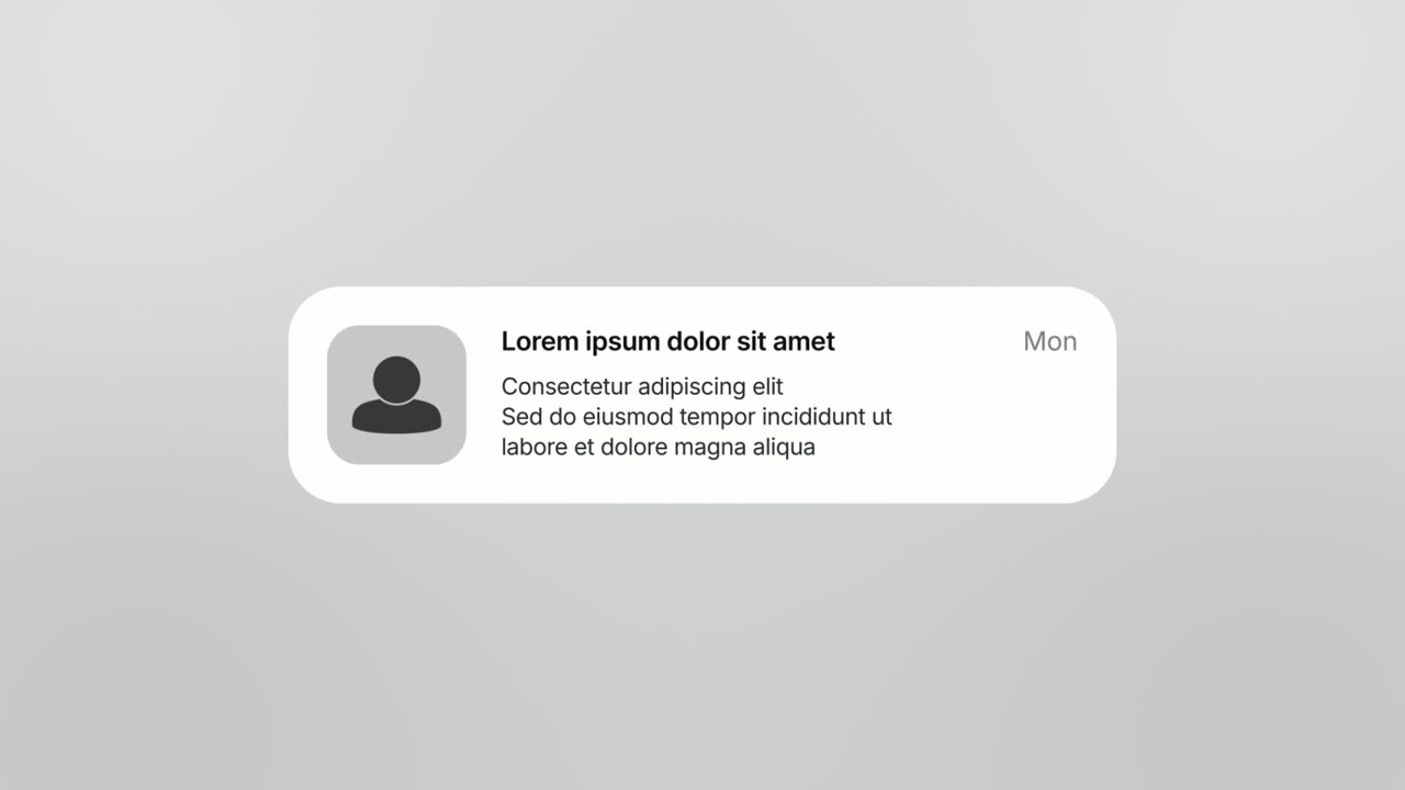
01Situation0-5 sec
A chat app icon with an unread badge opens into a phone-style banner: "Can anyone cover Saturday 9 to 5?"
“It starts with one message: can anyone cover Saturday?”
Template: Notification Pop. Alternatives: Chat Bubble, Word Zipper.
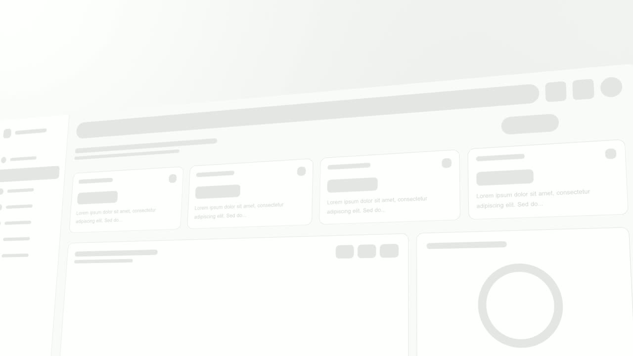
02First look5-9 sec
Rosterly's week view appears in one gentle sweep: the shift grid, the open shifts card and the team availability list.
“In Rosterly, the whole week sits on one board.”
Template: Sweep and Reveal. Alternatives: Hero Showcase, UI Unfold.
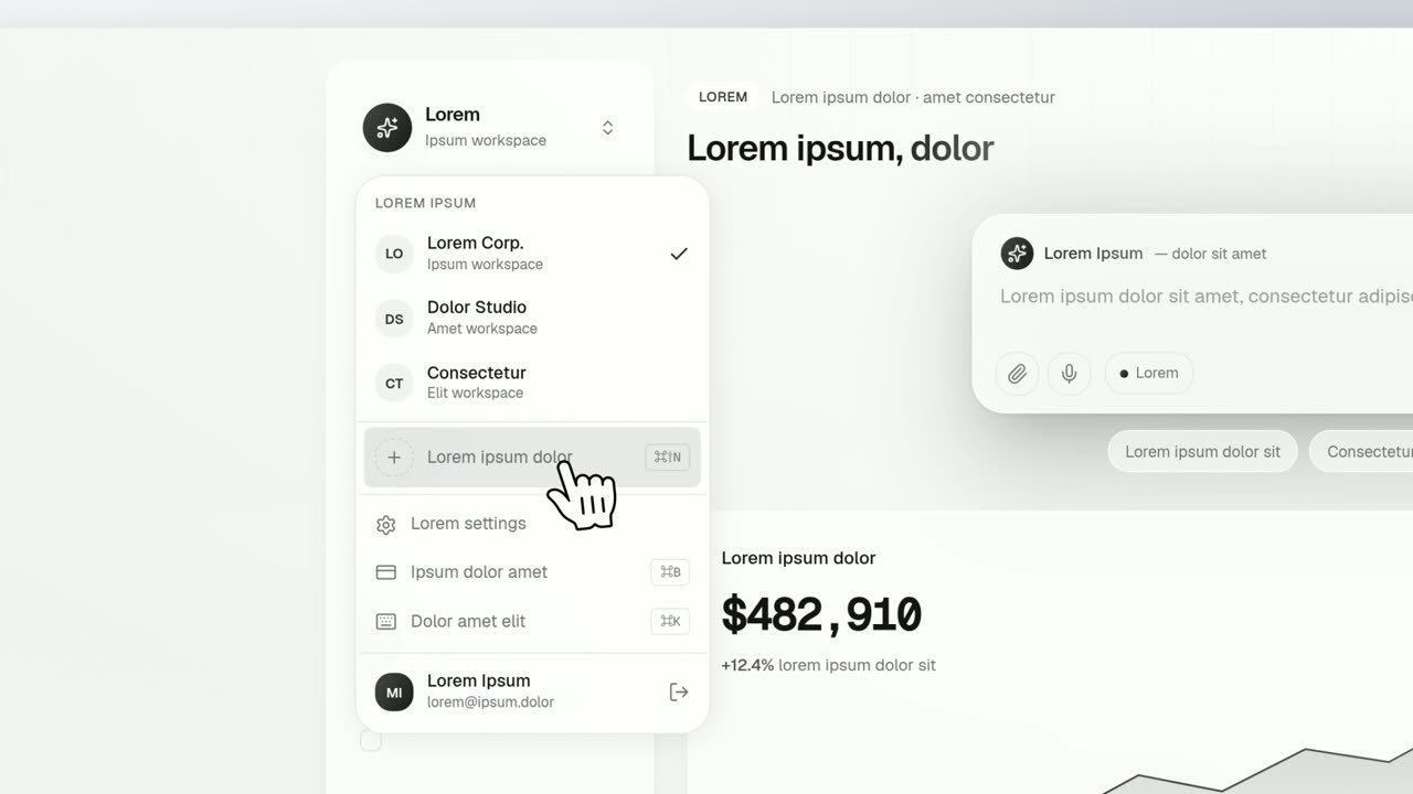
03Step 1: assign9-13 sec
The cursor opens the Assign menu on the Saturday shift, runs down the staff who are free, and clicks one name.
“Pick from the people who are actually free.”
Template: Dropdown Menu. Alternatives: Cursor Select.
04Step 2: adjust13-16 sec
The cursor picks up a Friday shift card, drags it onto Sunday and drops it in place.
“Move a shift by dragging it.”
Template: Drag-and-Drop. Alternatives: Cursor Connect.
05Step 3: publish16-19 sec
A close-up on the real Publish schedule button as the cursor glides in and presses it.
“Publish, and the week is set.”
Template: Cursor Press. Alternatives: Simple Button Press, Floating Button Press.
06Result19-23 sec
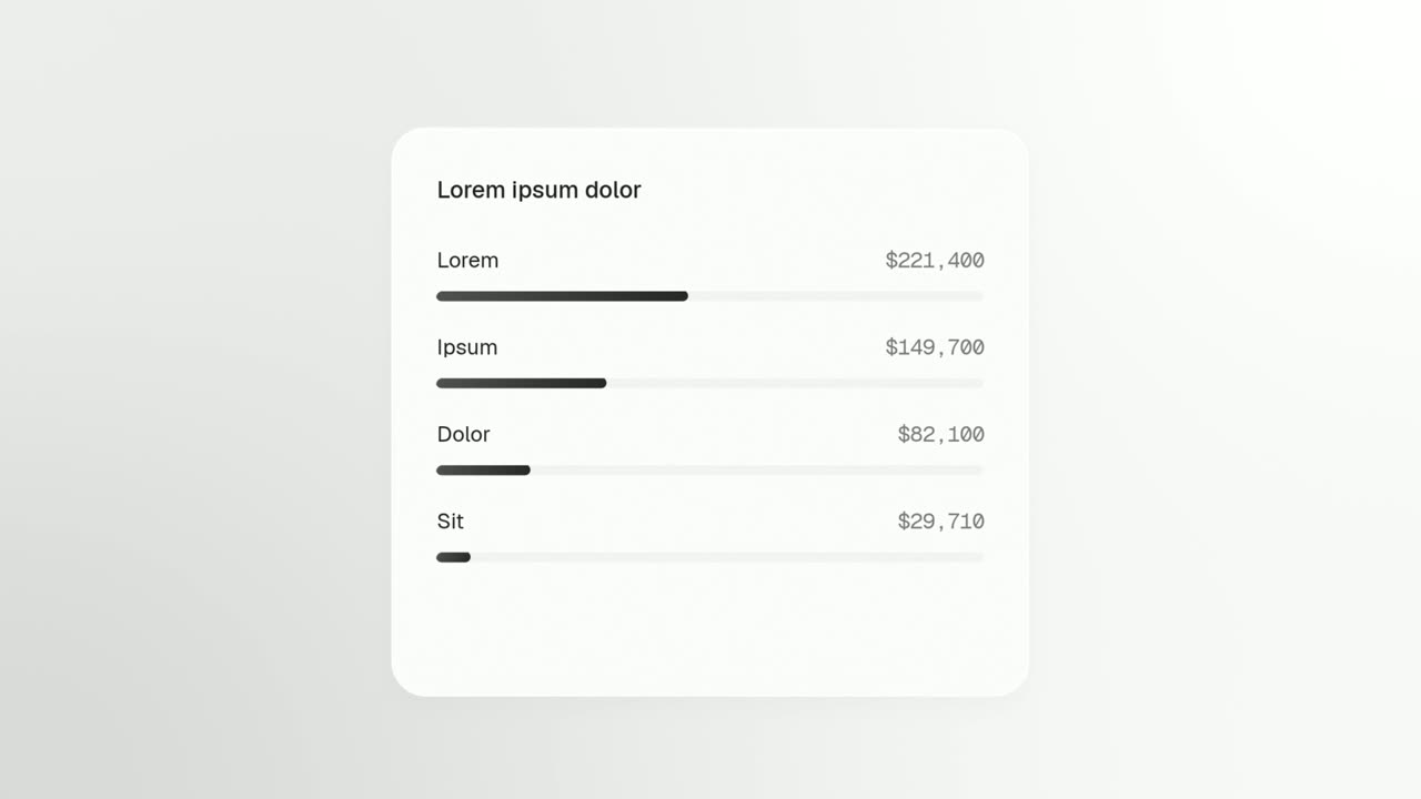
The published schedule sits in a clean window with every shift filled, holding still long enough to read.
“Every shift is covered, and everyone can see it.”
Template: Window Rise. Alternatives: Push Down.
07Call to action23-28 sec
The Rosterly logo appears, then a "Try it free" button that the cursor clicks.
“Plan next week in Rosterly. Try it free.”
Template: Call to Action. Alternatives: Logo Nudge.
Checklist
- Pick the one workflow your buyers care about most and write it as trigger, steps and result.
- Keep it to three to five steps and cut setup, settings and one-time configuration.
- Load a demo account with realistic names, numbers and dates.
- Hide or replace any real customer data.
- Close banners, chat widgets and tooltips before capturing.
- Zoom the browser in so the key components are large on screen.
- Write one narration sentence per scene, at about 2.5 words per second.
- End on the result screen, then one call to action.
- Link a longer recorded walkthrough for viewers who want every click.
Mistakes to avoid
- Starting at the login screen
- Nobody needs to watch you sign in or click through onboarding. Start where the value starts, with the situation and the first useful screen.
- Narrating every click
- Telling viewers what they can already see wastes the script. Use narration to explain why each step matters.
- Empty or fake-looking data
- Blank tables and placeholder text make a working product look unfinished. Stage a demo account that looks like a real customer's.
- Full-screen shots on small screens
- A whole browser window shrunk to a phone is unreadable. Push in on the part of the page that matters in each step.
- One demo for every audience
- A demo that tries to serve sales, finance and engineering at once ends up long and vague. Make a short one per audience instead.
- Waiting on real loading times
- A spinner that runs in real time drains momentum. One short loading moment is enough to show that work is happening.
How to make it with Wevi
Add your website
Wevi pulls your logo, colors and fonts from your site so the demo looks like your product, not a generic template.
Map the workflow to scenes
Give the Wevi Agent your workflow in a few lines, trigger, steps and result, and it picks templates and writes on-screen copy and narration. Or choose them yourself: a menu choice, a drag, a click and a result screen each have a template built for them.
Capture inside your app
Open your product in Wevi's browser, sign in yourself (Wevi never asks for your password) and select the components for each step. Wevi cuts them out of the page and recaptures a clean background behind them.
Add voice and render
Choose an AI voice from Wevi's library and a music track, then render in 16:9. If you work in Claude, ChatGPT or Cursor, the Wevi MCP connector can build the demo from a single request.
Templates for this video
Opener · your real UI
Dropdown Menu
Dropdown Menu is a 4-second scene where a cursor clicks a control on your real product page, its dropdown opens, and the cursor runs down the options…
Feature · your real UI
Cursor Select
Cursor Select is a five-second scene that opens on your whole product page, moves the camera in on one control, lifts it slightly and has a cursor…
Opener · your real UI
Text Typing In
Text Typing In is a 5-second scene where your real product page is on screen, a cursor clicks a field and the camera moves in while real text types…
Feature · your real UI
Drag-and-Drop
Drag-and-Drop is a three-second scene where a cursor picks up one real component from your product, drags it across the page and drops it into its…
Feature · your real UI
Cursor Press
Cursor Press is a three-second close-up where one real button or control from your product sits still and a cursor glides in and presses it.
Questions
How long should a product demo video be?
For websites, ads and sales emails, 30 to 90 seconds covering one workflow. For evaluators comparing tools or new users learning the product, a recorded walkthrough of three to five minutes is fine because they chose to watch. If you need both, make both and link the short one to the long one.
What is the difference between a product demo video and an explainer video?
An explainer answers why: what problem you solve and for whom, usually for people who have never heard of you. A demo answers how: it shows the product doing the job, for people who already understand the problem and want to see if you fit.
Can I make a product demo video without recording my screen?
Yes. Wevi captures your live product in a browser and animates the real interface with motion templates, so there is no recording to edit. It cannot import an existing screen recording, so if you need click-by-click footage, use a screen recorder for that version.
Can Wevi show parts of my app that are behind a login?
Yes. You open your app in Wevi's browser and sign in yourself, then choose the components to capture. Wevi never asks for your password, and using a demo account keeps real customer data out of the video.
What is a product demo animation?
It is a demo that uses motion design, such as camera moves, close-ups and animated text, instead of a raw screen recording. Built from your real interface, it keeps the honesty of a recording while cutting dead time and keeping every detail readable on a phone.
Is a demo video the right tool for a full tutorial?
No. Anything people need to follow step by step, such as setup guides or admin training, works better as a screen recording or an interactive walkthrough. Use the demo video to get people interested and the tutorial to get them productive.
Related guides
SaaS explainer video
Problem, solution, proof. Explain what your software does in under a minute.
Read the guideAI product demo video
Show prompts, answers and agents at work without a shaky screen recording.
Read the guideWebsite hero video
A silent, looping product video for the top of your homepage.
Read the guide