Explainer, demo or launch video: which do you need?
These three get mixed up, and making the wrong one is the most expensive mistake you can make.
- An explainer is for people who do not know you yet. It answers what is this and why should I care. It spends real time on the problem, because the viewer has to recognize themselves before they will listen to the solution.
- A demo is for people who already understand the problem and want to see how your product handles it. It spends most of its time inside the interface.
- A launch video announces something new to an audience that is paying attention for a moment. It is about the news.
If homepage visitors keep asking what the product actually does, you need an explainer. If trials stall because people cannot picture the workflow, you need a demo. Many SaaS companies end up with all three, but the explainer usually comes first because it does the most work on the page that gets the most traffic.
The four-part explainer script
- Problem, about 20 percent. Describe the situation in the customer's words, specific enough that they nod. "Feedback is everywhere" is vague. "The same feature request shows up in support, sales calls and app reviews, and nobody connects them" is real.
- Answer, about 15 percent. Name the product and show it for the first time, with one sentence on what it is.
- How it works, about 45 percent. Two or three steps, each shown in the real interface. Pick the steps that make the outcome feel inevitable, not the ones with the most engineering behind them.
- Outcome and call to action, about 20 percent. What work looks like afterwards, then one clear next step.
Word budgets keep you honest. At a natural pace of about 2.5 words per second, a 30-second explainer holds roughly 70 words, a 60-second one about 150 and a 90-second one about 220. Write the script first, cut every adjective that is not doing work, and drop category jargon your buyer would never use themselves.
Character animation or product-led animation?
Most explainer video makers and animation studios default to illustrated characters: a cartoon office worker buried in paperwork who ends up smiling at a laptop. That style works when the product is abstract or invisible, when it is aimed at consumers, and when you have the budget to keep the illustrations current.
For software, the product itself is usually the most convincing thing you can show. A product-led explainer animates your real interface instead: the problem is told with kinetic type and familiar app imagery, and the solution is shown in your real screens, with the camera moving to the parts that matter. It answers the question buyers are left with after a character explainer, which is what the product actually looks like.
The trade-offs are simple. Character animation can tell a human story but usually takes longer to make and to update. Product-led animation is faster to make and to refresh when your UI changes, but it cannot show people or places. Wevi makes product-led explainers only, so if your story depends on characters or live footage, an illustration studio or video team is the better fit.
Where to put it and how to keep it current
The explainer belongs where new visitors first land: in the homepage hero or just below it, next to your main signup button. Reuse the same file on paid landing pages, in the first email of an outbound sequence, at the top of your YouTube channel and in your sales deck.
A few placement rules:
- Use a poster frame that shows your product, not a title card, so the video looks worth playing.
- Make sure the on-screen text carries the story when it autoplays muted.
- Never hide the signup button behind the video. Let people skip it.
Explainers go stale when the interface changes. Plan to refresh yours whenever the UI gets a visible redesign or your positioning shifts. When the video is built from captured UI, that means recapturing the new screens and rendering again rather than commissioning a new animation.
A 30-second explainer for Signalboard (a fictional customer feedback hub), scene by scene
Every scene below is a real Wevi template; open one to see it move. The narration runs at a natural pace of about 2.4 words a second, so it fits the scene.
01Problem0-4 sec
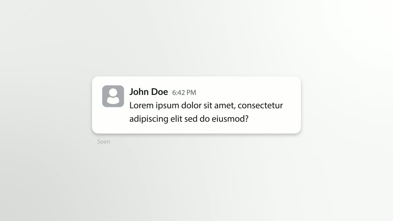
A customer's message types into a chat bubble: "Any news on the export feature I asked about?"
“Customers keep asking, and nobody writes it down.”
Template: Chat Bubble. Alternatives: Notification Pop, Hook Text Pop.
02Why it happens4-7 sec
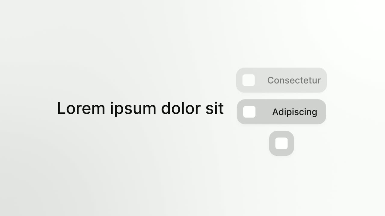
The headline "Feedback lives in" sits beside a column of pills showing real tools customers write in, such as a help desk, team chat and an app store, rolling to a stop.
“Because feedback lives in every tool.”
Template: Platform Roll. Alternatives: Close the Tabs, App Stack Fly-In.
03The answer7-11 sec
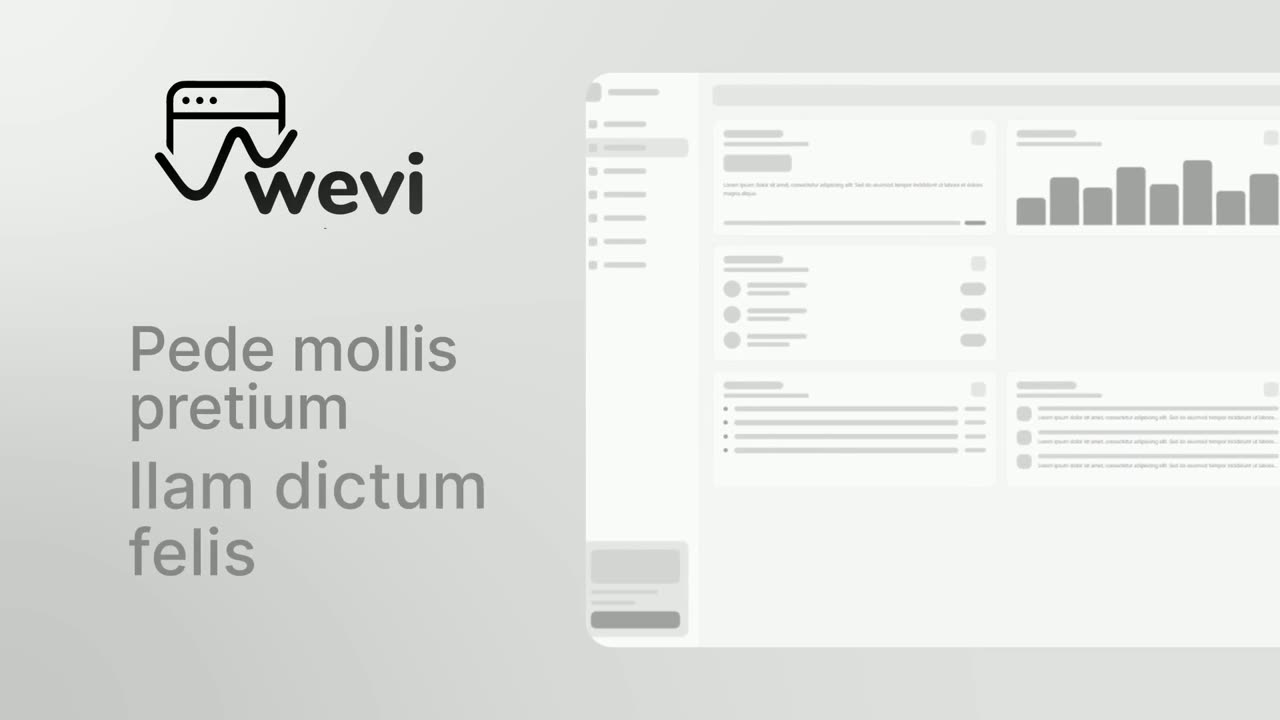
The Signalboard logo arrives, two short lines build ("Every request" and "One board"), and the real product window builds beside them.
“Signalboard puts every request on one board.”
Template: Opening Platform Reveal. Alternatives: Hero Showcase, Logo Nudge.
04How it works: collect11-17 sec
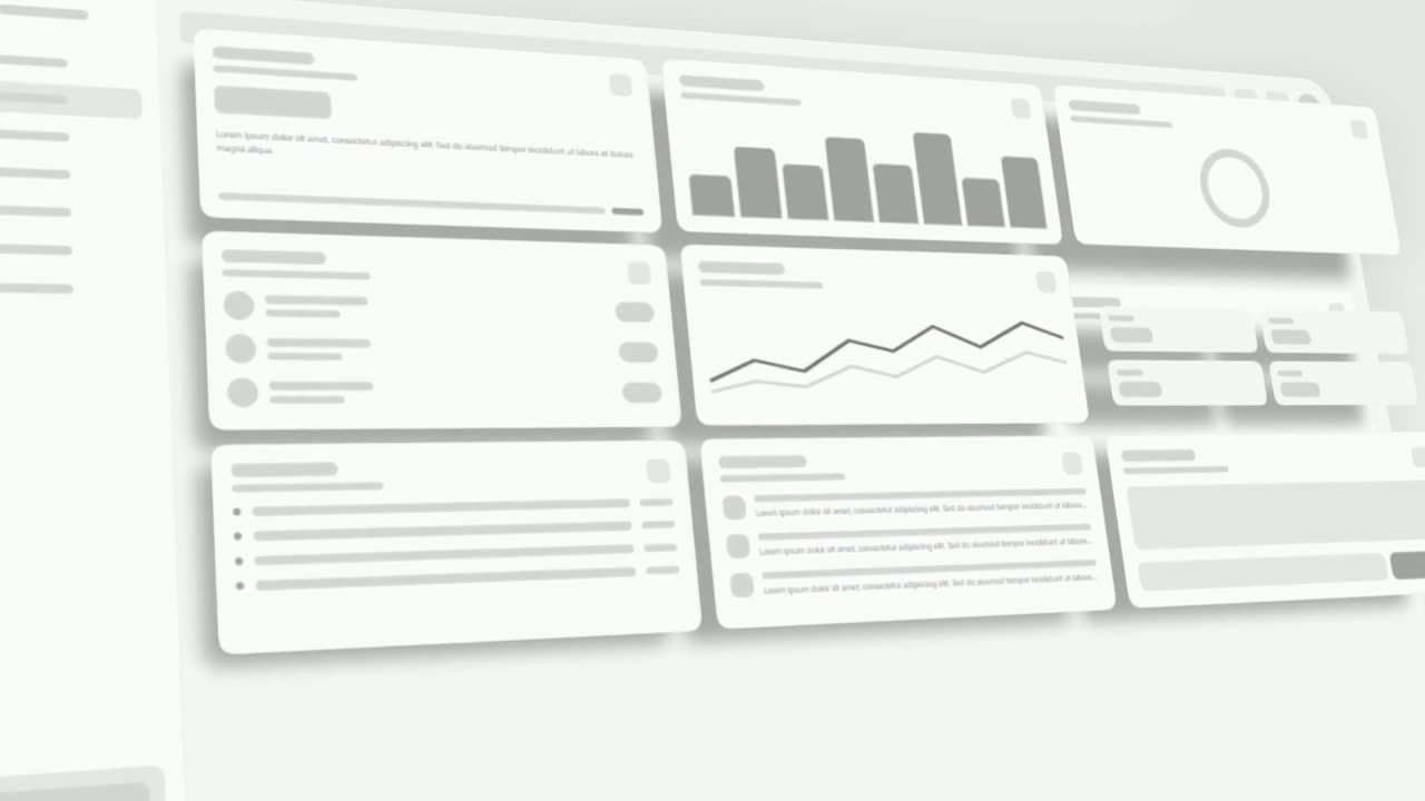
The real feedback board tilts into 3D and its cards lift off one after another: a support ticket, a call note, an app review, a feature tag.
“Tickets, call notes and reviews land as cards, grouped by feature.”
Template: 3D UI Hover. Alternatives: Rise & Reveal, UI Unfold.
05How it works: tag17-22 sec
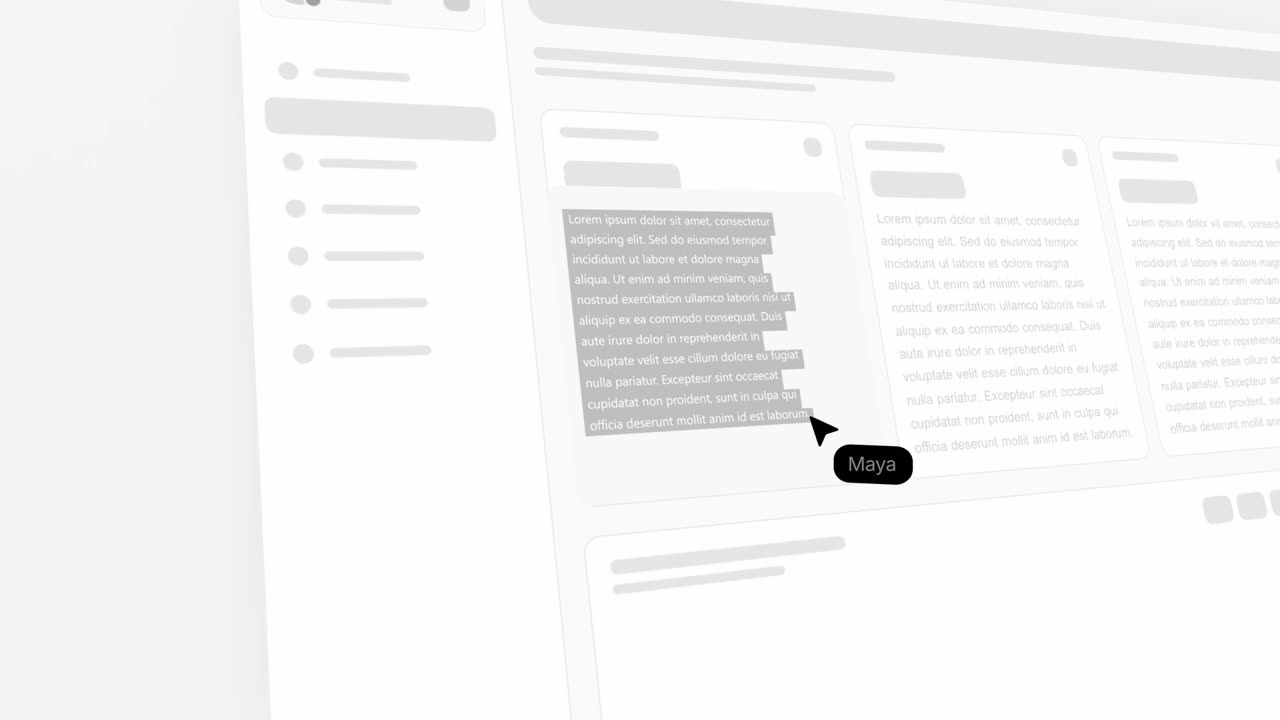
A cursor drags a highlight across one customer's sentence inside a feedback card.
“Highlight the sentence that matters and link it to your roadmap.”
Template: Text Highlight. Alternatives: Focus Outline.
06Outcome22-25 sec
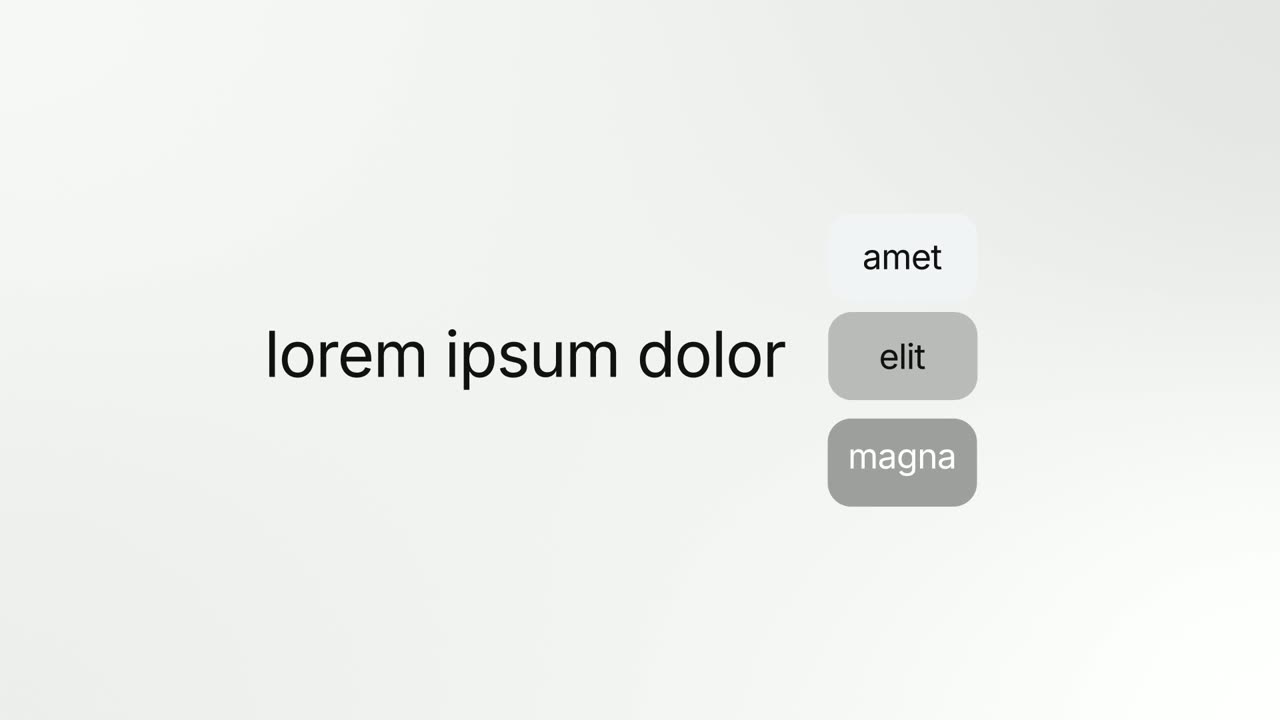
The line "Plan the roadmap with" is followed by three tags, Support, Sales and Success, which fold into the final word "everyone".
“So every team plans the roadmap together.”
Template: Vertical Label Pop-In. Alternatives: Word Wheel, Letter Snap.
07Call to action25-30 sec
The Signalboard logo appears, then a "Start free" button that the cursor clicks.
“Hear every customer. Start free with Signalboard.”
Template: Call to Action. Alternatives: Logo Glint.
Checklist
- Write the problem in your customer's words, borrowing a phrase from a real sales call or support ticket.
- Say what the product is in one sentence before second 12.
- Show how it works in two or three steps, each in the real interface.
- Keep the script within budget: about 70 words for 30 seconds, 150 for 60.
- Cut category jargon your buyer would not use.
- End with one call to action that matches the button next to the video.
- Check that the story makes sense muted, from the on-screen text alone.
- Choose a poster frame that shows the product.
- Set a reminder to refresh the video after your next visible redesign.
Mistakes to avoid
- Skipping the problem
- Jumping straight to features assumes the viewer already knows why they need you. Spend the first fifth of the video on a problem they recognize.
- Explaining the technology instead of the outcome
- Buyers care what changes for them, not how your pipeline works. Mention the engine only if it is the reason to buy.
- A character story with no product
- A cartoon that never shows the interface leaves software buyers wondering what they would actually use. Show the real product at least once.
- Too long for the homepage
- Past 90 seconds, most first-time visitors will not finish. Move the detail into a demo video and link to it.
- Letting it go stale
- An explainer showing last year's interface tells visitors the product is not maintained. Refresh it when the UI changes.
How to make it with Wevi
Add your website
Wevi reads your site for your logo, colors and fonts, so the explainer matches the homepage it will sit on.
Draft the script and scenes
Write a short brief covering the customer, the problem and the outcome, and the Wevi Agent drafts the problem, answer, how it works and call to action scenes with templates, on-screen copy and narration. Edit any line or swap any template.
Capture the real product
Wevi opens your app in a real browser and lifts out the components you pick for each step. You sign in yourself for anything behind a login, and Wevi never asks for your password.
Voice, music, render
Choose an AI voice and a music track and render in 16:9. You can also ask Claude or ChatGPT to make the explainer through Wevi's MCP connector, from brief to finished video, in one conversation.
Templates for this video
Opener · your real UI
Opening Platform Reveal
Opening Platform Reveal is a 4-second intro where your logo arrives first, then two short title lines build on one side while your real product…
Problem
Chat Bubble
Chat Bubble is a four-second scene where a single chat message types into its bubble beside the sender's avatar.
Opener
Platform Roll
Platform Roll is a 3-second scene where a short headline sits beside a column of pills that roll past one by one, each showing the name and logo of…
Problem · your real UI
3D UI Hover
3D UI Hover is a 6-second scene where your whole real product page tilts into 3D and the cards and widgets you choose lift off its surface one after…
Feature · your real UI
Interface Surround
Interface Surround is a five-second scene where a short title, a supporting line or your logo sits in the center while four real interface cards from…
Feature
Vertical Label Pop-In
Vertical Label Pop-In is an animated text label scene: a short sentence appears, three colored one word tags pop in beneath it, then the tags vanish…
Questions
How long should a SaaS explainer video be?
30 to 90 seconds for a homepage or ad, with 60 seconds as a sensible default. Longer explainers work only when the viewer has already chosen to invest the time, such as after signup or in a sales follow-up.
How many words should an explainer video script have?
About 2.5 words per second of video: roughly 70 words for 30 seconds, 150 for 60 seconds and 220 for 90 seconds. Leave a little room so the narration is not wall to wall.
Can Wevi make an animated explainer with characters?
No. Wevi cannot generate people, characters or scenery. It animates your real product interface, text, logos and app imagery, which suits software explainers where showing the product matters more than a character story.
What is the difference between an explainer video maker and an animation studio?
A studio scripts, designs and animates a custom video over several weeks with review rounds. An explainer video maker gives you ready-made animation that you fill with your own copy, brand and visuals, which is faster and easier to update but less custom.
Where should I put my explainer video?
On your homepage near the main signup button first, then on paid landing pages, in sales outreach, on YouTube and in your sales deck. Use a poster frame that shows your product so people can tell it is worth playing.
Should an explainer have a voiceover?
Usually yes, because an explainer carries more information than a feature clip and narration lets the visuals stay simple. Wevi uses AI voices from its own library; it does not clone a specific person's voice.