UI Unfold: a UI card animation that lays out your product at a glance
UI Unfold is a UI card animation that lays out up to twelve whole cards and panels from your real product, unfolding them flat row after row with no page behind them. They keep the arrangement they have on the real page, so a dashboard and its widgets, a set of plans or a panel of settings reads as everything in one place. It suits products whose value is having many tools on one screen.
The preview shows placeholder content. Your video uses your UI, words, logo and colors.
- Role
- Feature
- Length
- 4 seconds
- Uses
- Your real product UI
- Format
- 16:9, up to 4K
What it looks like
On a clean background with no page behind them, the cards and panels you captured unfold flat, one row after another. Each keeps its real position relative to the others, so the finished layout matches your product. Everything is in place about a second and a half in, then the full set holds while the voiceover names what the viewer is looking at. It runs about four seconds and feels tidy and confident.
It usually comes early in the middle, right after a problem scene or at the start of a feature tour, and it feels orderly and reassuring.
Best for
- Showing a dashboard and all its widgets at a glance
- Answering a scattered tools problem with everything in one place
- Laying out a set of plans, options or settings
- Opening a feature tour before the close ups
What you add
- A working screen of your product, not a marketing landing page
- One to twelve whole cards or panels, picked in reading order
- A voiceover line that names what is on screen
Capture tips
- Zoom the browser in as far as you can while everything you want in the shot still fits on screen. A bigger capture stays sharper in the video.
- Capture a working product screen such as a dashboard, a settings page or a list of plans, not a hero section.
- Select whole components with their own background and border. For a stat, pick the card that holds both the label and the number.
- Pick components with clear space around them, never nested or overlapping, in reading order. Three to seven read best.
Videos this scene works in
SaaS explainer video
Problem, solution, proof. Explain what your software does in under a minute.
Read the guideProduct demo video
Show the product working, step by step, in your real interface.
Read the guideProduct launch video
The 30 to 45 second video for launch day: what it is, who it is for, why now.
Read the guidePairs well with
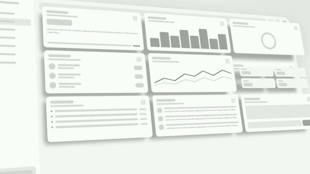
Problem · your real UI
3D UI Hover
3D UI Hover is a 6-second scene where your whole real product page tilts into 3D and the cards and widgets you choose lift off its surface one after…
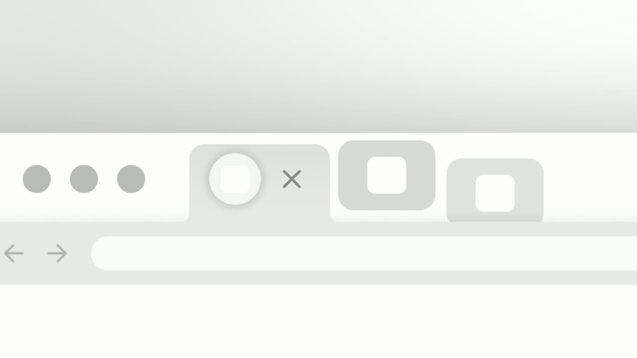
Feature
Close the Tabs
Close the Tabs is a three-second scene where a crowded browser tab strip, full of the tools your audience juggles, slides past and the tabs drop away…
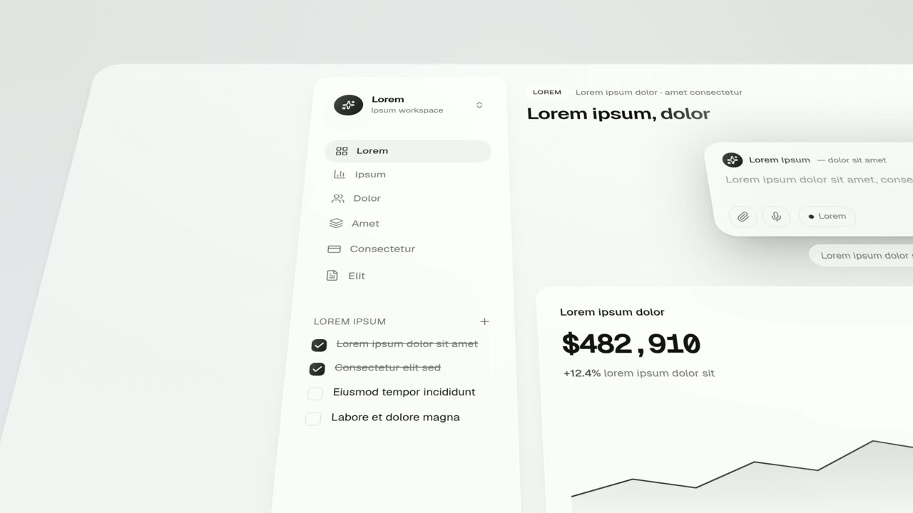
Feature · your real UI
Feature Lineup
Feature Lineup is a five-second scene where a set of real interface pieces flies up into a clean, centered lineup in front of their own page, then…
Questions
Can I pick components from different parts of the page?
Yes. There is no page background behind them, so pieces from different parts of a page work well, and they keep their real arrangement.
When is 3D UI Hover a better fit?
Use 3D UI Hover when the page itself should stay in view with components lifting off it. UI Unfold shows only the cards, which is better when the group is the point.
Can I capture my marketing site instead of the app?
UI Unfold is meant for a working product screen. Hero banners and page backgrounds do not read as cards, so capture the app itself.
Put UI Unfold in your next video
Describe the video in a sentence. The Wevi Agent reads your site, captures your product, plans the scenes and renders with voiceover and music. Start free.
Or ask your assistant: Make a launch video for mysite.com with Wevi and open on the UI Unfold scene