What a SaaS promo video is, and how it differs from a demo or explainer
A promo video has one job: make someone who has never heard of your product want to click. It is closer to an ad than a tutorial. A demo video shows how the product works, step by step, to people who are already interested. An explainer walks through why the problem exists and how your approach solves it. A promo skips most of that and sells a single outcome with pace, confidence and the real product on screen.
That focus is what makes promos work where attention is short: paid social, YouTube pre-roll, a LinkedIn post, the top of your homepage or a sales email. The viewer did not ask to watch, so the video has to earn every second.
A good software promo has three traits:
- One promise. Not a feature list. One result the viewer wants.
- Real product, early. Your actual interface appears within the first five to eight seconds, so the promise feels concrete.
- One next step. A single call to action that matches the page it links to.
Find the one promise before you write a word
Most weak promos fail before production, because the team could not agree on what to leave out. Write the promise as one sentence first: for [who], [product] [delivers what result] without [the pain they live with today]. If you need an and to finish it, you have two promos, not one.
Then pick the proof. Choose the one or two screens in your product that make the promise believable at a glance: the dashboard that fills itself, the button that replaces a manual task, the report a customer forwards to their boss. Those screens become the middle of your video. Everything else, including features you are proud of, belongs in a demo or an explainer.
Finally, decide how warm the audience is. A promo for cold traffic leads with the pain, because the viewer does not know you yet. A promo for people who already visited your site can lead with the product name and the result. Same product, different first five seconds, and often a different call to action.
Script and timing for a 30-second promo
A 30-second promo has room for six or seven scenes and roughly 60 to 70 words of narration at a natural pace of a little over two words per second. Fewer words is almost always better, because every scene needs a moment for the visual to land.
- 0 to 3 seconds, the hook. Name the pain or make a bold claim, on screen as text. For many viewers this is the only part they see.
- 3 to 8 seconds, the answer. Your product name and the first look at the real interface.
- 8 to 20 seconds, the proof. One or two moments in the product: data appearing, a click that does the work, a result worth reading.
- 20 to 25 seconds, the payoff. One line that sums up what the viewer gets.
- 25 to 30 seconds, the call to action. One button, one verb, the same words as your landing page.
Read the script aloud against a timer before you build anything. If you have to rush to fit, cut words, not pauses.
Cut it for every placement
Plan two versions from the start. The main cut runs 25 to 30 seconds for your site, YouTube and organic posts. The cutdown runs about 15 seconds for paid placements: keep the hook, one product scene, the payoff and the call to action. Building both from the same scenes keeps the message consistent and costs almost no extra work.
Design both for sound off. Many feeds start videos muted, so the promise, the product name and the call to action should all appear as on-screen text, with the voiceover adding warmth rather than carrying the meaning. Keep text large enough to read on a phone, and prefer close-ups of single components over full-page screenshots.
Be deliberate about format. A 16:9 landscape video fits YouTube, LinkedIn, X, websites and email thumbnails well. If your media plan depends on vertical placements such as Reels, TikTok or Shorts, you will need a separate vertical edit made in another tool, because Wevi exports landscape video only.
A 27-second promo for a sample client reporting tool, scene by scene
Every scene below is a real Wevi template; open one to see it move. The narration runs at a natural pace of about 2.4 words a second, so it fits the scene.
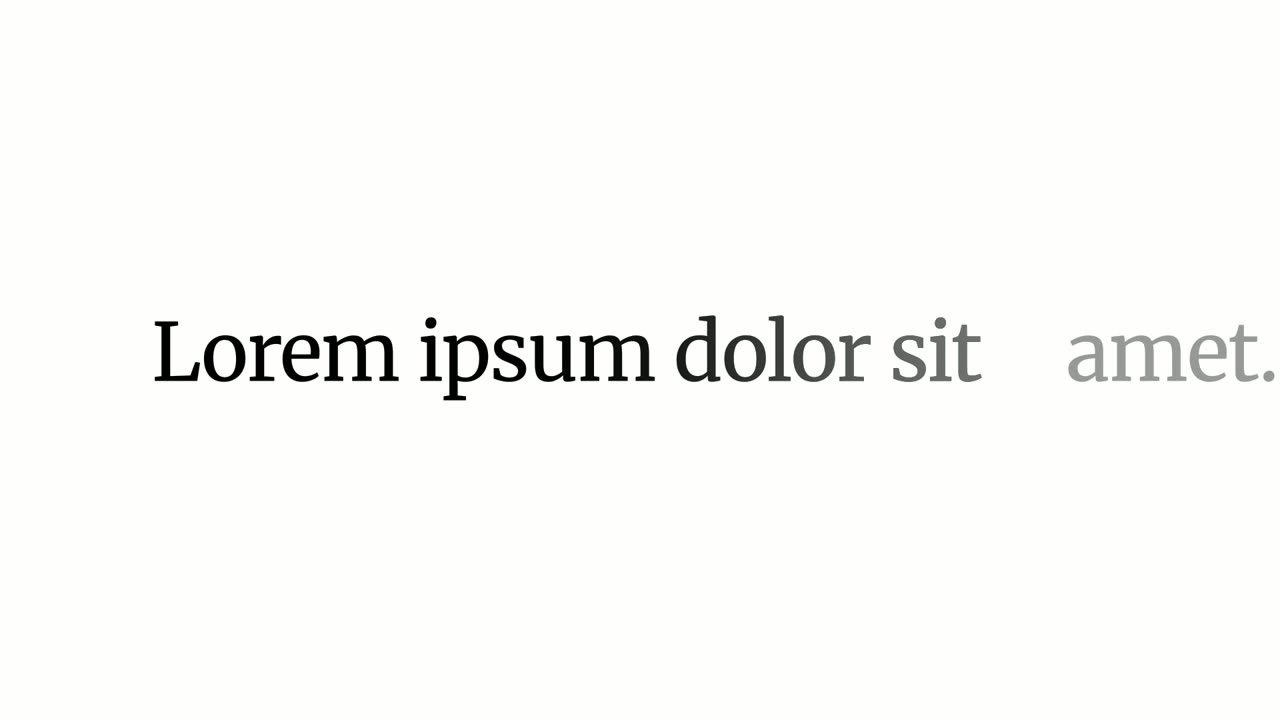
01Hook0-2 sec
One word, Stop, fills the whole screen, then snaps down to size as the rest of the line appears around it: Stop rebuilding client reports.
“Stop rebuilding client reports.”
Template: Snap Expand. Alternatives: Hook Text Pop, Word Zipper.
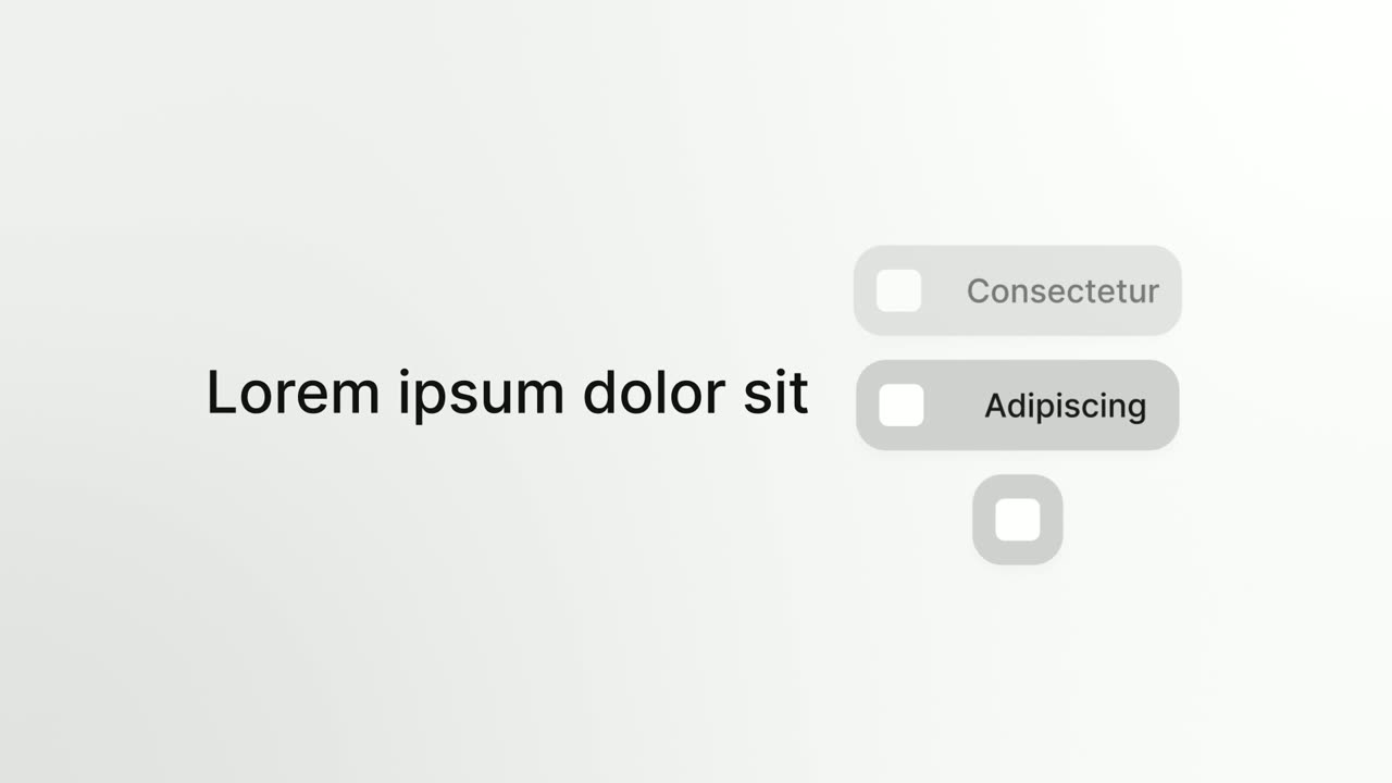
02Problem2-5 sec
A short headline ending in a linking word sits beside a column of pills that roll past one by one, each an ad or analytics platform the agency exports from, settling on the last one.
“Five platforms, five exports, every Monday.”
Template: Platform Roll. Alternatives: Close the Tabs, App Stack Fly-In.
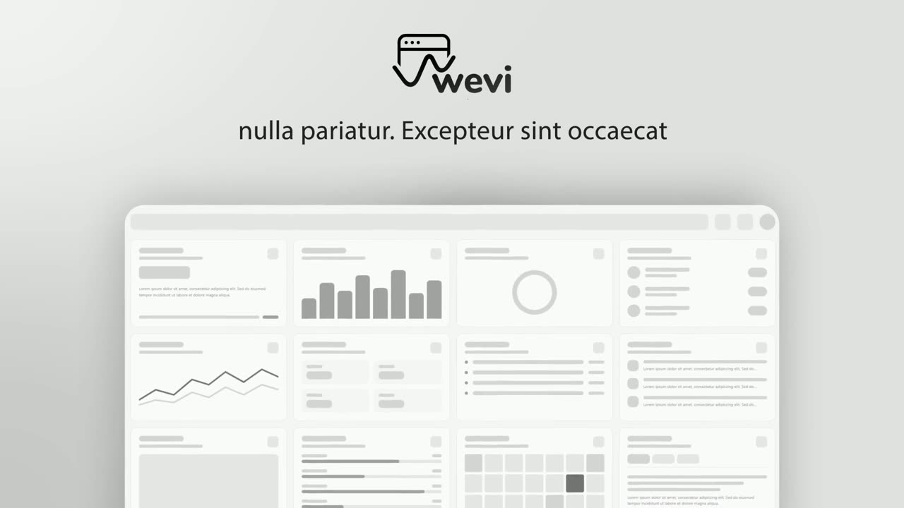
03Answer5-9 sec
The Fernwise logo with two short headlines, then the real reporting dashboard rises from below and takes over the screen.
“Fernwise pulls them into one live client report.”
Template: Hero Showcase. Alternatives: Opening Platform Reveal, Typecast.
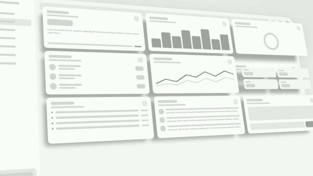
04Proof9-15 sec
The real dashboard tilts into 3D and its spend, leads and revenue widgets lift off the page one after another and hover above it.
“Spend, leads and revenue for every client, updated every hour.”
Template: 3D UI Hover. Alternatives: Sweep and Reveal, UI Unfold.
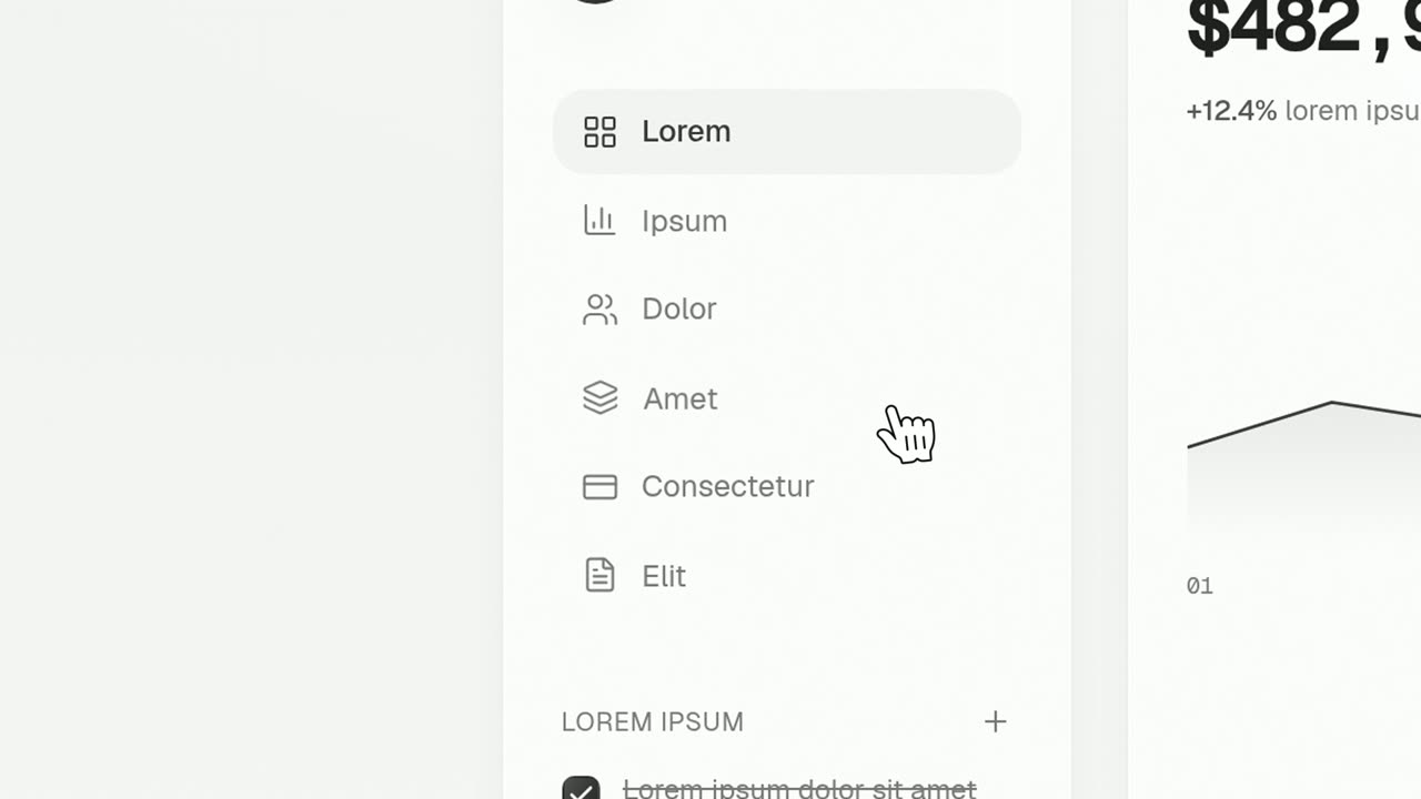
05Action15-18 sec
A tight close-up on the real Share report button as a cursor glides in and presses it.
“Hit share, and clients see it live.”
Template: Cursor Press. Alternatives: Simple Button Press, Floating Button Press.
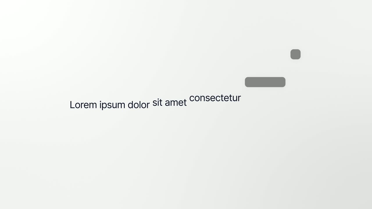
06Payoff18-22 sec
The dashboard breaks apart and five of its components become the words of one bold line: One report your clients actually read.
“One report your clients actually read.”
Template: Interface to Words. Alternatives: Vertical Label Pop-In, Letter Snap.
07Call to action22-27 sec
The Fernwise logo appears, then a Start free trial button that a cursor clicks.
“Try Fernwise free and send your first report today.”
Template: Call to Action. Alternatives: Logo Nudge.
Checklist
- The promise is one sentence about one result
- The hook names a pain or a bold claim as on-screen text in the first 3 seconds
- Your real product UI appears by second 8, not a mockup or stock footage
- No more than two features are shown
- Narration stays under about 70 words for 30 seconds
- Every key claim also appears as text for sound-off viewers
- Logo, colors and fonts match the landing page the video points to
- One call to action, worded exactly like the button on that page
- A 15-second cutdown is ready for paid placements
- The final export is 1080p with no watermark
Mistakes to avoid
- Turning the promo into a feature tour
- Six features in 30 seconds means none of them sticks. Show the one or two that prove the promise and save the rest for a demo video.
- Opening on the logo
- The first three seconds decide whether anyone keeps watching, and a logo gives them no reason to. Lead with the viewer's problem and bring the brand in a few seconds later.
- Showing mockups instead of the product
- Polished mockups that do not match the real app create a letdown at signup. Viewers trust what looks like software they could log into today.
- Asking for two different actions
- Start a trial or book a demo splits attention and weakens both. Pick the one step that fits where this video runs.
- Writing for sound on
- Feeds often start videos muted. If the meaning lives only in the voiceover, most viewers miss it.
- Using one cut everywhere
- A 30-second edit that works on your homepage can be too slow for a paid placement. Build a 15-second cutdown from the same scenes.
How to make it with Wevi
Add your website
Paste your URL and Wevi pulls your logo, brand colors and fonts, so the promo looks like the landing page it sends people to.
Plan the scenes
Write your one-sentence promise as a brief and the Wevi Agent drafts five to seven scenes with templates, on-screen copy and narration. Or pick templates yourself, such as Snap Expand for the hook, Hero Showcase for the first look and Call to Action to close.
Capture your real product
Wevi opens your live site or web app in a real browser and lifts out the dashboards, cards and buttons you choose, so every scene moves your actual interface. For screens behind a login you sign in yourself; Wevi never asks for your password.
Render with voice and music
Pick an AI voice and a music track and export a 16:9 MP4, then drop scenes to make the 15-second cutdown. You can also ask Claude or ChatGPT to build the whole promo in one step through Wevi's MCP connector, set up at wevi.ai/mcp.
Templates for this video
Opener
Snap Expand
Snap Expand is a 2-second text scene where one word fills the whole screen, then snaps down to size as the rest of the sentence appears around it.
Opener · your real UI
Hero Showcase
Hero Showcase is a 4-second scene that goes from your brand straight into your product: your logo sits in the center with two short headlines, then…
Problem · your real UI
3D UI Hover
3D UI Hover is a 6-second scene where your whole real product page tilts into 3D and the cards and widgets you choose lift off its surface one after…
Opener · your real UI
Interface to Words
Interface to Words is a 4-second scene where your real product page breaks apart and five of its components become the words of one bold sentence.
Feature · your real UI
Cascade Land V2
Cascade Land V2 is a high-energy scene where cards captured from your product fly in through a fast 3D camera move, land together as your real page…
Ending
Call to Action
Call to Action is a call to action end screen: your logo appears, then a button that a cursor clicks, telling the viewer exactly what to do next.
Questions
How long should a SaaS promo video be?
Aim for 15 to 30 seconds for ads and social posts, where viewers did not choose to watch. On your homepage or in a sales email, where people opted in, 30 to 45 seconds is fine. Wevi videos typically run 15 to 45 seconds across 3 to 6 scenes.
What is the difference between a promo video and a demo video?
A promo sells one outcome to people who do not know you yet, so it is fast, benefit-led and ends on a single call to action. A demo shows how the product works to people who are already interested, so it can be longer and more step by step. Many teams make the promo first and link it to a demo.
Can I make a promo video without a designer or video editor?
Yes. Template-based tools let you fill in copy, colors and images while the animation is already designed. In Wevi each scene is a professionally animated motion template: you choose the words, logo and captured UI, while the animation, timing and camera moves stay fixed, which keeps the result consistent.
Should a software promo show the real product or illustrations?
Show the real product. Illustrations can explain a concept, but buyers want to see what they will actually use, and a real interface makes the promise believable. Use a clean demo account with realistic data so nothing private or empty appears on screen.
Can Wevi make vertical promo videos for TikTok, Reels or Shorts?
No. Wevi exports landscape video at 16:9 (1920x1080) or 16:12 (1920x1440), not 9:16. Landscape works well on YouTube, LinkedIn, X, websites and in email; for vertical placements you would need a separate edit in another tool.
Is there a free promo video maker for software?
Wevi has a free plan you can use to build and preview a promo. Free exports are watermarked and capped at 720p, so for paid ads you will want a plan that exports 1080p or 4K without the watermark.
Related guides
Product launch video
The 30 to 45 second video for launch day: what it is, who it is for, why now.
Read the guideWebsite hero video
A silent, looping product video for the top of your homepage.
Read the guideLinkedIn and X product video
Product videos that work in LinkedIn and X feeds, sound off.
Read the guide