Why turn release notes into video
Written changelogs are thorough, but plenty of users never open them. A short video does a different job: it makes progress visible. Customers see that the product they pay for keeps improving, people who left see a reason to come back, and prospects see a team that ships.
A release notes video does not replace written notes. Keep the changelog as the record, with every fix, version and detail. The video is the highlight reel: the three to five changes a typical user would notice and care about, each shown in the real interface for a few seconds.
That split makes the video easy to scope. If an update needs a paragraph to explain or only matters to admins, it stays in the text. If it changes something people see or do every week, it earns a scene. And if one change is big enough to need its own story, it gets a dedicated feature announcement video, with a single scene in the monthly recap pointing back to it.
One scene per update: the structure
- Opener, 2 to 3 seconds. The period or version, such as "October update" or "What's new in 4.2". This is context, not a brand intro.
- Updates, 3 to 5 seconds each. One update per scene, biggest first. Show the change in the real product and say what it lets people do in one sentence.
- Small stuff, one scene. Fold everything else into a single scene: faster search, fewer bugs, better exports.
- Close, about 5 seconds. Where to try it, or a pointer to the full notes.
With three to five updates that comes to 20 to 45 seconds. Resist adding more, because a video listing twelve changes is just a written changelog read aloud.
Order matters. Lead with the change most users will feel, not the one that took longest to build. Viewers drop off as a video goes on, so whatever sits at the end is seen by the fewest people.
Make it a monthly habit, not a project
Update videos are worth more when they arrive on a schedule. A predictable cadence, monthly for most SaaS teams or once per major release for slower-moving products, teaches users to expect them and watch them.
To keep it light enough to sustain:
- Capture as you ship. When a change goes live, capture it that week instead of reconstructing everything at month end.
- Reuse the same structure. Same opener style, same closing scene, same voice and music. Only the update scenes change.
- Split the work. Product managers supply one line per update, what changed and who it helps, and product marketing turns those lines into the video.
- Date it. Put the month or version in the opener and the file name, so it is clear which video belongs to which release.
Twelve modest update videos a year put you in front of users twelve times. A single polished year-in-review puts you there once.
Where release notes videos get watched
- Top of the changelog page, above the written notes, for people who come looking.
- In-app what's new panel or announcement, where active users can click straight into the change.
- Monthly update email: use a still frame with a play button that links to the video, since many email clients will not play video inside a message.
- Help center articles for the updated features, so new users meet the change in context.
- LinkedIn and X: a native upload with the top change in the first line. Feeds often play video without sound, so the on-screen text should name each update.
- Customer success: a quick recap for business reviews and renewal calls.
Keep a playlist of past updates on YouTube or in your help center. Months of visible progress is a strong signal for prospects deciding whether your product will keep up with them.
A 25-second monthly update for Rosterly (a fictional shift scheduling app), scene by scene
Every scene below is a real Wevi template; open one to see it move. The narration runs at a natural pace of about 2.4 words a second, so it fits the scene.

01Opener0-3 sec
"October update" is drawn in light on a near black screen, then carried away.
“Four new things in Rosterly this month.”
Template: Glow Sweep. Alternatives: Typed Motion Title, Dual Color Title.
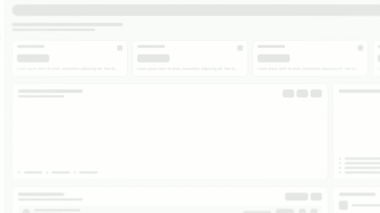
02Update 13-6 sec
The new Swap requests card floats alone, large enough to read, then cuts to it sitting in place on the schedule page.
“Staff can now request shift swaps themselves.”
Template: Feature Drop-In. Alternatives: Expand & Fill.
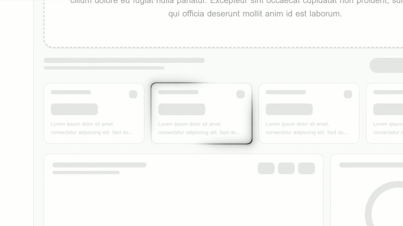
03Update 26-9 sec
On the real schedule page, a glowing outline draws itself around the new availability column.
“Availability now shows right on the schedule.”
Template: Focus Outline. Alternatives: Feature Callout.
04Update 39-13 sec
The payroll export panel turns a quarter turn into an outlined box, and "Payroll export" types into it.
“Hours now export straight to your payroll tool.”
Template: Turn & Type. Alternatives: Drop Into Place.
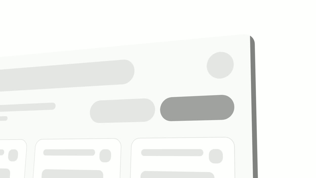
05Update 413-17 sec
A close look at the schedule toolbar as the new role, location and overtime filters slide in from the left.
“And new filters find any shift in seconds.”
Template: Left-to-Right Reveal. Alternatives: Pop-in Reveal.
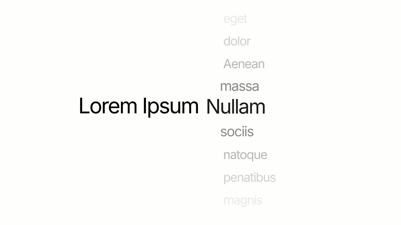
06Small fixes17-20 sec
The words "Now faster:" hold still while the last word spins through search, sync, exports, reports and mobile, then settles on "everything".
“Plus speed fixes across the whole app.”
Template: Word Wheel. Alternatives: Vertical Label Pop-In.
07Close20-25 sec
The Rosterly logo appears, then a "See what's new" button that the cursor clicks.
“It's all live now. Open Rosterly to try it.”
Template: Call to Action. Alternatives: Logo Nudge.
Checklist
- Pick three to five changes users will notice and leave the rest in the written notes.
- Order updates by how many users they affect, biggest first.
- Write one sentence per update saying what it lets people do.
- Capture each change from production in the week it ships.
- Put the month or version in the opener and in the file name.
- Keep each update to a single scene of 3 to 5 seconds.
- Fold minor fixes into one closing scene.
- End with where to try it or a pointer to the full notes.
- Post it at the top of the changelog, in-app and in the update email on the same day.
- Reuse the same opener, voice and music every month.
Mistakes to avoid
- Reading the changelog aloud
- A video that lists every ticket is slower and less useful than the text. Show only what users will see and feel.
- Internal language
- Ticket numbers, code names and "refactored the sync service" mean nothing to customers. Describe what they can now do.
- Burying the biggest change
- Chronological order can put your best update at the very end, after many viewers have left. Lead with it.
- Inconsistent timing
- One video in March and nothing until August teaches users not to expect them. A simple monthly rhythm works better than an occasional polished one.
- Showing old screens
- If a capture predates the final design, users will look for something that is not there. Recapture after release.
How to make it with Wevi
Add your website once
Wevi pulls your logo, colors and fonts from your site, so every monthly update looks consistent without redesigning anything.
Brief the month's top changes
Give the Wevi Agent a short brief listing the updates worth showing, and it plans a scene for each, picks templates and writes on-screen copy and narration. Trim or reorder before you capture anything.
Capture each update in your app
Open the pages where each change lives, sign in yourself (Wevi never asks for your password) and select the new card, column or panel. Wevi lifts each one off the page for its own scene.
Render with voice and music
Keep the same AI voice and music track each month and render in 16:9. You can also ask Claude or ChatGPT to turn your changelog into a video through Wevi's MCP connector, so the monthly update becomes one request.
Templates for this video
Opener
Glow Sweep
Glow Sweep is a 3-second title scene where a sweep of light draws one short name on a near black screen, burns it bright and carries it away.
Feature · your real UI
Feature Drop-In
Feature Drop-In is a three-second scene where one real component from your product floats alone, large enough to read, and then the shot cuts to the…
Feature · your real UI
Focus Outline
Focus Outline is a three-second scene where your real page is zoomed in and a glowing outline draws itself around one component.
Feature · your real UI
Turn & Type
Turn & Type is a card flip reveal animation: one real component from your product turns a quarter turn, empties into a clean outlined box, and a…
Feature · your real UI
Left-to-Right Reveal
Left-to-Right Reveal is a four-second detail shot where your real page is tilted in 3D, seen close up, and up to seven chosen components slide in…
Opener
Word Wheel
Word Wheel is a 3-second text scene where a fixed opening holds still while the last word spins like a picker wheel through a list of words and…
Questions
What is a release notes video?
A short video, usually 20 to 45 seconds, that shows the most important changes in a product update, each in the real interface. It sits alongside written release notes or a changelog, which remain the full record.
How often should I make a product update video?
Monthly works for most SaaS teams that ship every week or two, because a month gives enough changes to fill a video without it getting long. Products with slower release cycles can make one per major version instead. Consistency matters more than polish.
What is the difference between release notes and a changelog?
A changelog is usually a running, concise list of every change, often dated or versioned. Release notes describe a specific release in more detail for customers. A video works on top of either, highlighting the few changes users will notice.
How many updates should one video cover?
Three to five, with one scene each and minor fixes grouped into one closing scene. More than that turns it into a list nobody finishes, and a single big change deserves its own feature announcement video.
Can I use screen recordings of each update?
Not in Wevi, which does not import screen recordings. It captures your live product and animates the real interface, which keeps each update to a few readable seconds. If an update needs a step-by-step walkthrough, record that separately for your help center.
Should a monthly update video have a voiceover?
It helps, especially in-app and in email where people choose to press play. Keep one sentence per update and make sure the on-screen text names each change, so it still works when it autoplays muted in social feeds.
Related guides
Feature announcement video
One new feature, shown in context, in 15 to 30 seconds.
Read the guideProduct launch video
The 30 to 45 second video for launch day: what it is, who it is for, why now.
Read the guideLinkedIn and X product video
Product videos that work in LinkedIn and X feeds, sound off.
Read the guide