
Stack & Build: a design to product animation from your real UI
Stack & Build is a four-second scene where a few real pieces of your product sit in a selection frame on a design canvas and fan out into a stack, like parts in a design file. A whip cut then drops them into the live product, and the page types itself in around them row by row. It suits stories that move from the parts to the whole.
The preview shows placeholder content. Your video uses your UI, words, logo and colors.
- Role
- Opener
- Length
- 4 seconds
- Uses
- Your real product UI
- Format
- 16:9, up to 4K
What it looks like
The scene opens on a design canvas with a selection frame around your pieces, such as badges, tags, icon tiles, status pills or buttons. They fan out into a stack about two thirds of a second in. At about one second a whip cut carries them into your live page, where the rows of text around them type themselves in one by one. It feels clear and building.
It works as an opener or as the bridge from the idea into the product, and it feels clear and building.
Best for
- Bridging from the idea into the product
- Showing the building blocks that make up a workflow
- Introducing steps, statuses or tools that repeat down one list
- Opening on the parts before the whole page appears
What you add
- A capture of the page that holds the pieces, taken at the top without scrolling
- One to twelve small pieces that repeat down one list or column
- One voiceover sentence of 9 to 13 words
Capture tips
- Zoom the browser in on the list or panel that holds the pieces so it fills most of the screen.
- Select small whole pieces with their own shape, such as badges, tags, icon tiles, status pills or buttons. Three to six read best.
- Pick pieces that repeat down one list or column, and never a piece and something inside it.
- Make sure the rows of text around the pieces are in the capture, because they type themselves in after the cut.
Videos this scene works in
Product launch video
The 30 to 45 second video for launch day: what it is, who it is for, why now.
Read the guideSaaS explainer video
Problem, solution, proof. Explain what your software does in under a minute.
Read the guideProduct demo video
Show the product working, step by step, in your real interface.
Read the guidePairs well with
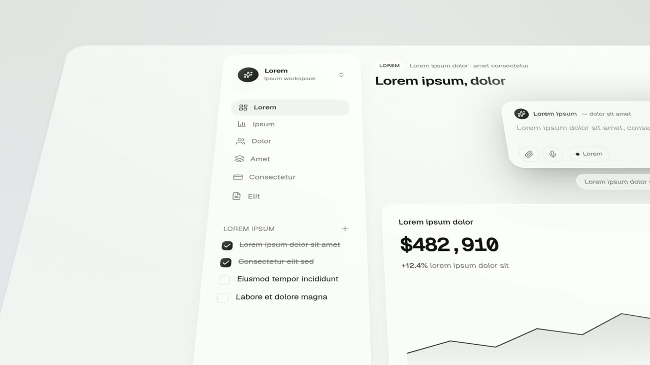
Feature · your real UI
Feature Lineup
Feature Lineup is a five-second scene where a set of real interface pieces flies up into a clean, centered lineup in front of their own page, then…
Feature · your real UI
Feature Drop-In
Feature Drop-In is a three-second scene where one real component from your product floats alone, large enough to read, and then the shot cuts to the…
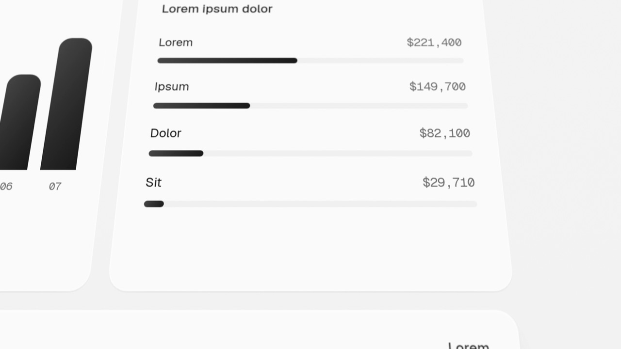
Feature · your real UI
Page Glide
Page Glide is a two-second scene where the camera glides over your real product page in 3D.
Questions
What if I have one big component?
Use Feature Drop-In, which cuts one component onto its page. Stack & Build needs a few small pieces from one list.
How should the voiceover be timed?
One sentence of 9 to 13 words that names the building blocks and reaches the product at the cut, about one second in.
Can it close the video?
No. It is not built as a call to action. Use it early, where the story moves into the product.
Put Stack & Build in your next video
Describe the video in a sentence. The Wevi Agent reads your site, captures your product, plans the scenes and renders with voiceover and music. Start free.
Or ask your assistant: Make a launch video for mysite.com with Wevi and open on the Stack & Build scene