Logo Toggle: a settings toggle animation that ends on your logo
Logo Toggle is a settings toggle animation: a small card rises with your logo, a name and a switch, the switch clicks on, and then the card folds away to leave your logo alone. It makes setup feel like one tap and carries the idea of set it once and forget it. It suits products, features or integrations that run by themselves once they are enabled.
The preview shows placeholder content. Your video uses your UI, words, logo and colors.
- Role
- Transition
- Length
- 3 seconds
- Uses
- Your words and logo
- Format
- 16:9, up to 4K
What it looks like
A small settings card rises into view holding your logo, a name beside it and a switch. The switch clicks on. Then the card folds away and your logo is left alone in the frame. The name can be your product or the specific feature being turned on. It runs about three and a half seconds and feels calm, effortless and a little satisfying, closer to a quiet sign off than a big reveal.
It usually comes after the problem as a short payoff or just before the call to action as a sign off, and it feels calm and effortless.
Best for
- Showing a product or feature that runs on its own once enabled
- Turning on an integration in one tap
- Signing off quietly just before the call to action
- Paying off a problem with a simple, switched-on fix
What you add
- Your logo, pulled from your website
- A product or feature name to sit beside the switch
No recording needed
This scene is built from your words, logo and brand colors. Add your website and Wevi pulls your logo, colors and fonts, so it matches your product without design work.
Videos this scene works in
Integration announcement video
Announce a new integration with both logos and the workflow it unlocks.
Read the guideFeature announcement video
One new feature, shown in context, in 15 to 30 seconds.
Read the guideProduct launch video
The 30 to 45 second video for launch day: what it is, who it is for, why now.
Read the guidePairs well with
Feature
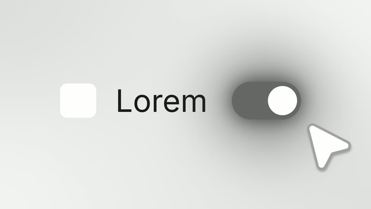
Switch On
Switch On is a toggle switch animation: a settings row shows your logo on an app icon tile, your product name and a switch that is off, and a cursor…
Feature
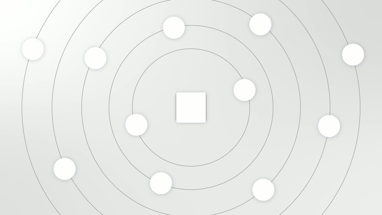
Integration Orbit
Integration Orbit is a five-second scene where your brand logo sits in the middle while up to eleven other logos circle it on rings.
Ending
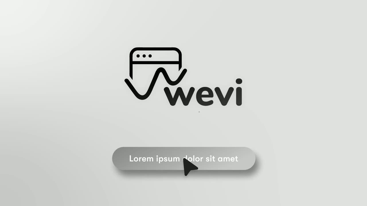
Call to Action
Call to Action is a call to action end screen: your logo appears, then a button that a cursor clicks, telling the viewer exactly what to do next.
Questions
How is Logo Toggle different from Switch On?
Logo Toggle ends with the card folding away to leave your logo alone, so it doubles as a brand sign off. Switch On focuses on the flick itself, with a cursor and a color flood across the switch.
Can Logo Toggle open a video?
It is not built as an opening hook or for stating a problem. Use it after the problem is set up, or just before the call to action.
What goes in the name next to the logo?
Your product name, or the name of the feature or integration being turned on.
Put Logo Toggle in your next video
Describe the video in a sentence. The Wevi Agent reads your site, captures your product, plans the scenes and renders with voiceover and music. Start free.
Or ask your assistant: Make a launch video for mysite.com with Wevi and open on the Logo Toggle scene